A big dose of sunlight, possibly even bigger than the big skylight that's being installed in the new Penn Station, is coming to the MTA.
In October, Gov. Hochul signed a bill that requires the MTA to publish its internal data "including information regarding its budget, finances, ridership, routes, and service" in a legible, easily downloadable format. The bill, a year's long effort by transit and open government advocates to bring more transparency to the MTA, directs the agency to publicize the datasets that get turned into semi-legible information in the MTA's board books and a handful of other public facing performance metrics. If the bill works, gone will be the days of data on PDFs that researchers can't manipulate in favor of easily accessible contract and vendor information.
The transit agency has three years to reveal hundreds of datasets, so until then, the city's premier transit nerds are here to help the MTA by telling the agency what it should be making public.
Make a real open book
In the short term, the MTA should release data from their board books on the open data portal, because right now most of it is locked in hundreds of pages of PDFs. The data they currently release in spreadsheet form - daily ridership numbers, and data from their performance and budget transparency dashboards, for example - should be consolidated in one place on the portal.
Other high-priority datasets include tables from the MTA's financial plans, like debt loads and staffing/headcounts numbers, and capital plan data including the number and amounts of change orders on projects, and basic information about contracts and vendors.
These datasets will help outside groups better evaluate the MTA's financial condition and understand how taxpayer dollars and fares are being used.
— Rachael Fauss, senior research analyst at Reinvent Albany
Get granular
As we are still dealing with the effects of the pandemic, I would like to see more granular data of transit ridership by the hour to analyze how commuting patterns have changed, as well as the data of train trips that have been canceled as a result of worker shortage.
The MTA has these wonderful dashboards on their website, but the data that drives them is not very accessible. For instance, the data for elevator availability is reported to the board every quarter in PDF format. Having this data available in a standardized format, along with data pertaining to subway and bus performance would go a long way in providing transparency to the public.
— Sunny Ng, developer, goodservice.io
The climate, police and crowds
Climate resilience projects: This would be like a special designation in the dashboard, or, what we've asked for, is a separate dashboard that details what projects in the capital program specifically improve resilience of the system. The MTA has repeatedly said that funding climate resiliency projects is an investment principle of the current capital plan, but it is difficult to decipher which of the many projects in the plan specifically address resiliency when the projects aren't coded as such.
Transit police data: Specifically, understanding how many summons are issued for fare evasions, where these summons are given, and the cost of deploying police to enforce fare evasion rules.
Subway crowding: This is a performance metric that the MTA does not make available to the public on a route-basis like it does other metrics in the subway dashboard, but is something we know that they keep track of (the 2016 state of the subway report from the Straphangers Campaign used the 60-minute Weekday AM Rush Peak Load Point Summary given to the campaign from Transit). This is useful to have in understanding which routes need more frequent service.
— Liam Blank, policy and communications manager at Tri-State Transportation Campaign
Survey says: More rider data
The results of MTA rider surveys should be posted on the dashboard in a way that highlights key measures - rider demographics, mode/line/route, trip purpose, fare products used. The MBTA has a good example of a portal for their most recent survey from 2015-17. As far as I can tell, the MTA just posts a PDF summary of results and then massive raw data files of their rider surveys, which are time-intensive to comb through and difficult to even open (took my computer a while to load the data, all the while making a scary/tired noise in protest).
The MTA should keep a public record on past, current, and future service changes. Right now they make it possible to look up current and future service changes (posted here) but archive past changes. Key indicators should be posted on the dashboard graphically (like the MBTA rider survey portal, the performance dashboard, or like the MTA's own bus or subway dashboards)
More ridership data, including: boardings and alightings for every route and stop, labeled by direction of travel and aggregated by the hour.
More detail on service delivered, including trips per hour, coded by route, stop, and direction. (It’s possible to construct this info from the GTFS feeds but it’s very time-consuming and still incomplete.)
A big theme here is that the MTA already posts a lot of data about service delivery and ridership, but that they could do everyone a solid by making it more accessible. Current problems include: the data is scattered in different, hard-to-find locations; the fields are inconsistent across agencies (i.e. Metro-North and Long Island Rail Road don’t post the same stuff); the formats are difficult to work with, not posted as standard CSVs or shapefiles; and the way data is labeled is often confusing (i.e. you can’t tell what a certain field represents, so you have to ask an insider). So just fixing that kind of stuff would go a long way toward making the data usable to a lot more people.
— Mary Buchanan, Tom Pera and Ben Fried, TransitCenter
Be legible to everyone
The information on the MTA’s Open Data portal should be helpful — and make sense — to riders, elected officials and all stakeholders who use and fund the services the agency provides. It’s about building and rebuilding trust — something that’s always important, but particularly critical when the MTA is working to encourage riders to get back onboard, and as elected officials at the federal, state and local level seek assurances that public money is being used wisely.
For riders, it should include information on things like causes of why some trains and buses weren’t run – crew shortages, delays in service, issues with rolling stock that required them to go out of service, something else? This information should be available for each hour of a day, and should not only be available by month, but should be available by day as well. Similarly, information about crowding by line, station/stop and time of day should be made available. Visualization should be used to the greatest extent possible.
For those doing a deeper dive, all data in the MTA Board books should be available in spreadsheet format, and underlying data used to calculate the metrics should be available.
On the capital side, we’d like to see dashboards/visualizations that provide information about the various projects in the Capital Program, including details on changes to projects and change orders. For example, changes in the completion of project designs and the start and completion of construction, and changes in project scope are not noted. Changes in project costs over time are available in the budget history section for each project, but there is no information on why project costs changed, and what the money saved or added would be used for.
There is a lot of positive change happening at the MTA and opening the door to information will allow the different publics to see how it affects them, and what still needs to be done.
— Lisa Daglian, executive director, Permanent Citizens Advisory Committee to the MTA
End the riddle of the turnstile
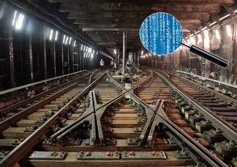
The MTA should publish more human-friendly turnstile data at the station level, which I do here, but I shouldn't have to.
I've elaborated on this in a blog post. The problem is that the MTA publishes raw turnstile data, which has a steep learning curve for anyone, even those who are data savvy, to get anything useful out of it.
For example, here is a line from the MTA's turnstile data:
C/A,UNIT,SCP,STATION,LINENAME,DIVISION,DATE,TIME,DESC,ENTRIES,EXITS
A002,R051,02-00-00,59 ST,NQR456W,BMT,10/23/2021,00:00:00,REGULAR,0007656317,0002622663
This is a record for a single turnstile, and the entries and exits are the two numbers at the end of the line. However, these numbers are like odometer readings, they represent a moment in time. You can't get an idea of the number of people who entered or exited a turnstile unless you have an earlier reading to compare to.
On top of that, there's little value in knowing how many people entered and exited a single turnstile, so aggregating this information by station (or station complex where two or more stations are connected) is a common way to aggregate these readings up.
I've been processing and publishing a cleaned up (human friendly) version of this data for over a year, but this is the kind of thing that would be great for the MTA to do so it's coming from a more authoritative place. That doesn't mean they shouldn't also publish the raw data. Ideally, they would also open up the transformation technique that they use to go from raw to aggregated.
— Chris Whong, data analyst and mapmaker, Qri.io
Get the feds involved
Gov. Hochul has promised transparency under her new administration. One way she can accomplish this is by having all of the information submitted to the FTA by MTA posted on its agency web site in addition to the state open data portal as well.
The Federal Transit Administration provides $1.5 billion in annual capital grants to the MTA. This is accomplished under the FTA Transit Award Management System (known as "TrAMS") that is used to award and manage federal grants. The MTA currently manages an active portfolio of federally funded capital improvement projects and programs in open grants worth over $12 billion in direct federal financial assistance. This does not include potentially $10 billion in CARE COVID-19 relief funding from Washington that has yet to be received under future approved grants.
As part of the requirements contained within all master grant agreements, using the FTA TrAMS System, the MTA, provides updated Quarterly Financial and Milestone Progress Reports to the FTA on active capital improvement projects and programs. These are required to be submitted within 30 days after the fiscal quarter has started on the first of the month and ends on the last day the third month. Federal fiscal quarters are October - December, January - March, April -June and July - September.
Information contained includes status of capital project contract award or initiation of in house projects. You can learn if projects and programs are progressing on schedule, completed on time and within budget, based upon the original approved grant milestones and budget. Explanations for project delays and change orders over $100,000 are provided. Project delays require recovery schedules and revised interim milestones to document future completion. Financial drawdowns against open grants illustrate if funds are being expended on a timely basis. Unspent funds carried over year after year are provided, Open grants with no recent financial activity or older grants with small balances and no recent financial activity can be viewed. Change orders for construction projects over $100,000 have to provide documentation on how they are fair and reasonable.
— Larry Penner, former federal transit official
The laundry list
Ridership by hour by line for each agency: Hourly ridership data by line is necessary to assess the customer impacts of possible fare structure or service changes. Peak fares are currently expected to return to the commuter railroads next year, for example, but the budget impacts of various policy options are difficult to estimate without fully detailed ridership data by time and by line.
Peak and off-peak running times by subway line: Peak and off-peak average end-to-end running times of each subway line are a valuable indicator in assessing subway performance and service delivery. Among other things, this is the best metric against which the efforts of the "SPEED Unit" can be benchmarked. These statistics have been occasionally reported ad hoc in SPEED Unit slide decks but are not yet consistently published as a performance benchmarking metric.
Capital data requests: Add a label with the "needs code" of each project as a variable in the Capital Program Dashboard. The needs code is an indicator of the type of investment--state of good repair, normal replacement, system enhancement, etc--that is regularly used in both the five-year capital plans and the 20-year needs assessments.
Clarify the funding, commitment, and completion workflow within MTA Construction and Development reporting. The capital program dashboard reports the phase of each project--planning, design, construction, complete--but not the commitment status of the project. The monthly Capital Program Oversight Committee materials, in turn, report the funding status of each plan at a very high level by funding source, but it is not clear whether the sum of funds not yet received corresponds exactly to the sum of uncommitted project spending. Clarifying the workflow from funding to commitment to completion--and reporting this for each project, connected to its funding source, and including the anticipated year of spending--would bring welcome transparency to all capital reporting.
Add Agency and Category ACEP code labels (Agency, Category, Element, Project codes) for each capital project as a variable in the downloadable output from the Capital Program Dashboard. On the capital program tracker’s website, the online portal sorts projects by Agency and Category code, but the downloadable output drops that useful formatting. The Agency and Category code labels can be re-labeled manually, but this adds an unnecessary data processing barrier to comparisons of spending by Agency and Category across plans and against past needs assessments.
— Alex Armlovich, senior research associate at Citizens Budget Commission