Beyond ‘KSI’: How DOT Can Identify Unsafe Streets Before Tragedy Strikes
In prioritizing streets for safety redesigns and selling them to the public, the Department of Transportation uses a statistic based on the total number of people killed or severely injured at any given location — a stat known as “KSI.” The metric shows planners where the city’s failure to produce safe streets has had deadly or near-deadly consequences.
But other elements — safety features, or lack thereof, and general quality of life — aren’t a part of KSI, and often fall through the cracks.
DOT’s mission is “to provide for the safe, efficient, and environmentally responsible movement of people … and to maintain … the quality of life of … city residents.” New Yorkers keep dying despite those lofty goals, so how might the agency do better?
To start, the agency should reconsider the KSI metric as a guide to which intersections and corridors should receive funding. It’s flawed; for instance, no single intersection or corridor was designated as a “priority” on the Upper West Side in the updated 2023 Borough Pedestrian Safety Action Plan, despite 37 road deaths there in the last decade.
I think there are other ways to gauge the safety needs of a particular street.
With that in mind, I walked along two chronically dangerous streets on the Upper West Side this summer — noting where there were shade trees or benches for people to rest and chat, and where there were safety elements for pedestrians. These things (and many, many others) make a neighborhood safer and more livable. I mapped these safety features and where they were absent and created a replicable metric that DOT could use instead of KSI.
In technical terms, I assigned a score every 15 paces along W. 95th and W. 96th streets, including cross-streets. I assigned higher numbers to areas that were more accessible or had more features such as benches, bike parking in the curb lane, or narrow street entrances to slow cars. Locations where the sidewalks and streets lacked preventative safety measures scored lower. I color-coded the numbers — green for safe, red for unsafe — and mapped them:
I loosely based my scoring rubric on questions the New York City Housing Authority created to monitor safety and quality of public space in its facilities. My rubric included the following questions:
- Could someone who has trouble walking, such as an older person or someone in a wheelchair, be able to easily enter and use this space?
- Does this space have areas to spend time, sit and/or rest?
- Does this space have areas for children to play safely?
- Does this space have areas that provide shade from the sun or shelter from the rain?
- Is this a space young and old can use at the same time?
- Does the space appear to be well-lit at night?
- Can you use this space year-round?
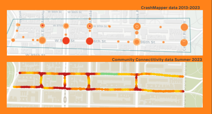
Unsurprisingly, DOT’s KSI map and my Community Safety map paint the same story. One measures harm that has been done, while the other anticipate where future harm could occur. Bright red areas that performed poorly in my study were also the places in the neighborhood where people have been killed, as the side-by-side comparison below demonstrates:
It of course makes sense to measure the number of people who die, but we need a different metric to fix the underlying problem of safety on city streets — one that is community-centered and doesn’t reduce our assessment of a certain street’s needs to grim numbers.
On top of KSI, DOT should measure sidewalks and intersections for accessibility, functionality, and safety, shifting the mindset of planners from reactive to proactive. DOT should highlight an area’s unique physical and social identities, such as quieter, tree-lined streets and neighbors knowing one another. These elements can be reinforced through better street design.
If this new metric were used, not only would it produce safer streets, but it would also improve the overall health and well-being of the community.
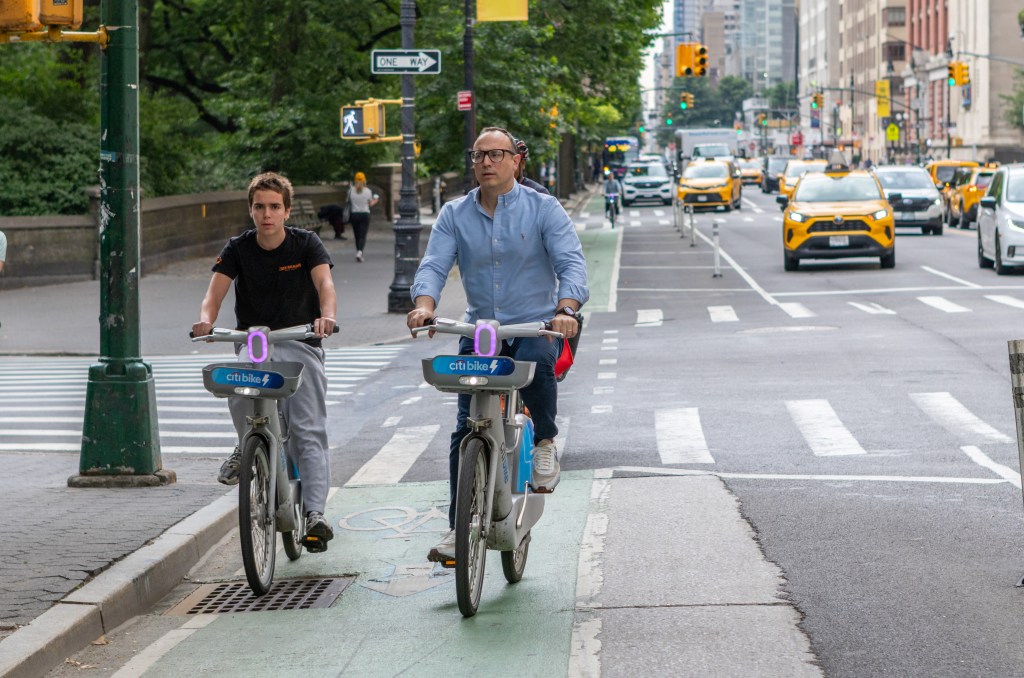
Car drivers killed at least 10 pedestrians in the last two years on the Upper West Side. Death, injuries, noise, and frustrated pedestrians are the norm in the Manhattan residential neighborhood. The area is replete with street signs memorializing people killed by drivers including several white “ghost bikes” representing fallen cyclists in particular.
By implementing their own safe street design at the places shown on this new map, DOT can protect New Yorkers, increase our quality of life, and prevent more of us from dying in car-related crashes. Those 37 people who died on the roads between W. 110th and W. 59th streets deserve to be more than a statistic; they deserve to be the catalyst for change.

Read More:
Streetsblog has migrated to a new comment system. New commenters can register directly in the comments section of any article. Returning commenters: your previous comments and display name have been preserved, but you'll need to reclaim your account by clicking "Forgot your password?" on the sign-in form, entering your email, and following the verification link to set a new password — this is required because passwords could not be carried over during the migration. For questions, contact tips@streetsblog.org.