MTA Will Start Using Common-Sense Metrics to Show Subway Riders How Their Trains Perform
Starting Wednesday, transit riders will be able to see for themselves how their subway lines are performing, when the MTA launches an online dashboard showing how much time riders lose due to trains that are off-schedule.
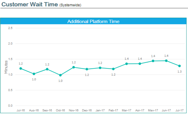
Agency officials previewed the dashboard today for the MTA board’s transit and buses committee. The dashboard will display two new metrics — “additional platform time” and “additional train time” — which calculate service quality in rider-centric terms: the extra minutes that riders typically spend on platforms or trains compared to a scenario in which service operates perfectly according to schedule.
Transit advocates have been calling on the MTA to adopt this type of metric, which is considered best practice in the transit industry, to more clearly communicate system performance to riders.
“The measures we have historically used — wait assessment, and on-time performance, as well as [major incidents and train capacity] — are measurements of trains, not people,” said MTA Chief of Operations Planning Peter Cafiero. “These are measures showing impacts [on] actual customers.”
Riders will be able to look up the new metrics for each line, and for the system as a whole, going back to July 2016. Providing these metrics was one of the top requests from transit advocates when newly-appointed MTA Chair Joe Lhota announced plans for the dashboard in July.
Advocates applauded today’s announcement while noting a few omissions they want the MTA to address going forward, including historical wait time trends going back farther than last July and wait time metrics for buses. (Which can be done: TransitCenter worked with grad students at NYU to produce a beta version of a wait time dashboard for buses, using publicly available BusTime data.) Cafiero said the agency will continue to refine and improve the dashboard after its public release on Wednesday.
The dashboard includes a few other new indicators, including a measurement of how long elevators and escalators are out of service.
Also included: “major incidents” — sources of delay broken down by subway line; “capacity provided” — the proportion of scheduled trains that actually arrive within a given amount of time; and results from subway car and station cleanliness surveys.
Several other metrics are grouped under the heading of “legacy indicators” that the MTA has been measuring for decades. These include the service metrics that make more sense to MTA managers than riders, as well as key maintenance metrics like the average distance between mechanical failures on trains.
One missing piece appears to be a progress tracker for capital projects and major maintenance work. That information is supposed to be provided on the MTA’s existing capital program dashboard, but the agency stopped listing the original project timelines, rendering it next to useless. As Reinvent Albany’s John Kaehny told Streetsblog in July, the only ironclad way to ensure the continued publication of MTA performance metrics is to codify it in law.

Read More:
Streetsblog has migrated to a new comment system. New commenters can register directly in the comments section of any article. Returning commenters: your previous comments and display name have been preserved, but you'll need to reclaim your account by clicking "Forgot your password?" on the sign-in form, entering your email, and following the verification link to set a new password — this is required because passwords could not be carried over during the migration. For questions, contact tips@streetsblog.org.