How US Energy Emissions Compare (It’s Not Pretty)

This eye-opening map from the Sightline Institute's blog uses US Department of Energy figures to demonstrate how individual states stack up against nations from around the world in terms of greenhouse gas emissions from energy use. The figures are especially astonishing when you look at the population comparisons (which can be found in spreadsheet form here). Just a couple of examples: Arizona, with 5.6 million residents, produces comparable emissions to Nigeria, with 122.8 million. And 19.2 New Yorkers manage to produce as much as 68.1 million Turks. Overall the map represents a comparison of fewer than 300 million Americans to more than 1.5 billion people in the other nations listed.
Stay in touch
Sign up for our free newsletter
More from Streetsblog New York City
Tuesday’s Headlines: Valley of Political Death Edition
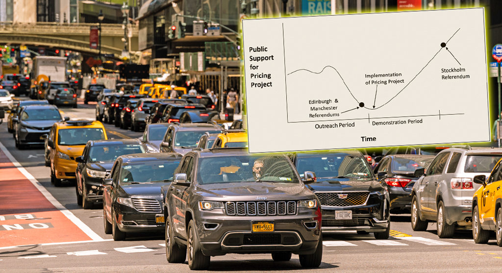
Did you see the new poll showing congestion pricing is really unpopular? Ignore it! Good times are coming. Plus other news in today's headlines.
Open Streets Groups Warn of Extra Red Tape to Run Events
Two weeks notice for hopscotch or a yoga class?

Monday’s Headlines: A Federal Case over Parking Edition
We're flicking our bicycle bell over a big scoop last week that no one picked up on...yet. Plus other news.

Hochul, Legislators Reach Toll Evasion Crackdown Deal
Higher fines for covering a plate and for not paying tolls are part of the budget deal inked on Saturday.

Behind the Scenes: How Gov. Hochul Got ‘Sammy’s Law’ Over the Finish Line
Opponents didn't want to put their name on a no vote for the life-saving measure.